
How to create buttons of specific shape
-
How can you create in HTML with CSS buttons to have this shape?
I want them all to have the same width based on the text and some padding, and be centered inside a div. Also I do want those lines at the sides to be included as well, as they make them look nicer and also give you a sense of the button space/size.

That example I made in a desktop app and can not be translated, as it is not HTML based.
-
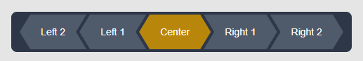
Use a simple clip-path polygon... then negative margin to pull them closer for the border appearance.
Something like this:
<!DOCTYPE html>
<html lang="en">
    <head>
        <meta charset="UTF-8" />
        <meta name="viewport" content="width=device-width, initial-scale=1.0" />
        <title>Diamond Navigation</title>
        <style>
            body {
                margin: 0;
                padding: 50px;
                font-family: Arial, sans-serif;
                background-color: #e5e5e5;
            }

            .diamond-nav {
                display: flex;
                align-items: center;
                justify-content: center;
                margin: 0 auto;
                width: fit-content;
                height: 50px;
                padding: 4px 17px;
                background-color: #2d3748;
                border-radius: 8px;
            }

            .nav-item {
                display: flex;
                align-items: center;
                justify-content: center;
                height: 50px;
                line-height: 50px;
                padding: 0 30px;
                margin-inline: -5px;
                box-sizing: border-box;
                white-space: nowrap;
                background-color: #4f5a6b;
                color: white;
                text-decoration: none;
                font-size: 14px;
                font-weight: 400;
            }

            /* Left group - both point left */
            .nav-item:nth-child(1),
            .nav-item:nth-child(2) {
                clip-path: polygon(15px 0, 100% 0, calc(100% - 15px) 50%, 100% 100%, 15px 100%, 0 50%);
            }

            /* Center group - points both ways */
            .nav-item:nth-child(3) {
                clip-path: polygon(15px 0, calc(100% - 15px) 0, 100% 50%, calc(100% - 15px) 100%, 15px 100%, 0 50%);
            }

            /* Right group - both point right */
            .nav-item:nth-child(4),
            .nav-item:nth-child(5) {
                clip-path: polygon(0 0, calc(100% - 15px) 0, 100% 50%, calc(100% - 15px) 100%, 0 100%, 15px 50%);
            }

            /* Active state styling */
            .nav-item.active {
                background-color: #b8860b;
            }

            /* Hover effects */
            .nav-item:hover {
                background-color: #5a6578;
            }

            .nav-item.active:hover {
                background-color: #cd950c;
            }
        </style>
    </head>
    <body>
        <div class="diamond-nav">
            <a href="#" class="nav-item">Left 2</a>
            <a href="#" class="nav-item">Left 1</a>
            <a href="#" class="nav-item active">Center</a>
            <a href="#" class="nav-item">Right 1</a>
            <a href="#" class="nav-item">Right 2</a>
        </div>
    </body>
</html>
I have done the heavy lifting for you. If you want borders, then I'll leave that one to you 😉
ps: As another thought, you could rotate the elements 45 degrees and use the parent as a clip region to give the top and bottom a flat edge ... but I will leave you to experiment with it...