
Web Page Colour Schemes...........oh dear
-
This must have been a candidate in the "oh my.......wtf where they thinking" web page colour scheme awards. WARNING: welder goggles required (sunglasses just aren't dark enough) http://www.paco-systems.co.uk/anti_slip.html[^] Dalek, that wasn't one of your early creations was it?? :)
Dave Find Me On: Web|Facebook|Twitter|LinkedIn
Folding Stats: Team CodeProject
Reminds me of 'The gr1d' (a programming game that seems to have died). The developer just set it up so the site picked a random colour-scheme from kuler every hour, and just left it that way. Some of those themes just didn't work for a webpage...
500 characters in this space, 500 characters in this space, paste the above, write a bit more, 369 characters left in this space...
-
This must have been a candidate in the "oh my.......wtf where they thinking" web page colour scheme awards. WARNING: welder goggles required (sunglasses just aren't dark enough) http://www.paco-systems.co.uk/anti_slip.html[^] Dalek, that wasn't one of your early creations was it?? :)
Dave Find Me On: Web|Facebook|Twitter|LinkedIn
Folding Stats: Team CodeProject
Including animated gif for the logo, of course. Back to the 90s!
-
This must have been a candidate in the "oh my.......wtf where they thinking" web page colour scheme awards. WARNING: welder goggles required (sunglasses just aren't dark enough) http://www.paco-systems.co.uk/anti_slip.html[^] Dalek, that wasn't one of your early creations was it?? :)
Dave Find Me On: Web|Facebook|Twitter|LinkedIn
Folding Stats: Team CodeProject
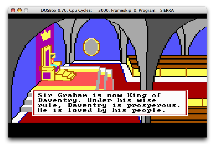
Hm, seems to a slight improvement over that: http://www.dribin.org/dave/blog/images/kq2.png[^] At least the font has a better resolution ;)
-
This must have been a candidate in the "oh my.......wtf where they thinking" web page colour scheme awards. WARNING: welder goggles required (sunglasses just aren't dark enough) http://www.paco-systems.co.uk/anti_slip.html[^] Dalek, that wasn't one of your early creations was it?? :)
Dave Find Me On: Web|Facebook|Twitter|LinkedIn
Folding Stats: Team CodeProject
I'll meet your neon green and raise you by garish colours and a bunch of animated gifs! Just check this site out, if the home page colour scheme isn't bad enough, just browse a few of the other pages. Kudos if you can find the dressed up dog or the 'Welcome' video! http://www.fabricland.co.uk/[^]
-
This must have been a candidate in the "oh my.......wtf where they thinking" web page colour scheme awards. WARNING: welder goggles required (sunglasses just aren't dark enough) http://www.paco-systems.co.uk/anti_slip.html[^] Dalek, that wasn't one of your early creations was it?? :)
Dave Find Me On: Web|Facebook|Twitter|LinkedIn
Folding Stats: Team CodeProject
I couldn't find my welder's glasses. I don't believe they would have helped very much, though. Instead, I used a piece of 1/8" aluminum sheet. Darn thing got so hot I couldn't hold it! Had to pull the plug to shut off the computer!~ I will say one thing about that page: It is at least readable. So many are equally gaudy but not readable by most mortals. The worst sites (and software) that use their own colors mixed with Windows System Colors. They will use something like "Button Color" for text on their own White background. I use a variant of High Contrast Black in which the Button Color is Yellow. Can you read Yellow text on White? I have often thought that the "page background color" (or image) ought to be stricken from the web HTML repertoire. In particular the capability of being able to use something that is part of that background as a "clickable" area. So many sites use this ancient scheme, and if you tune your browser to ignore background colors/images, you can't see where to click. Similarly, I believe that being able to specify Windows colors mixed with hard-coded colors is so problematical as to make life miserable for about 30% of the population who use some special Windows color scheme that aids them. My ophthalmologist teaches at a local university. He is considering assigning a project to study the effect of "bright background - dark text" color schemes in relation to eye problems, including the possibility that some problems might be CAUSED by excessive use of such bright themes.
RussCA
-
This must have been a candidate in the "oh my.......wtf where they thinking" web page colour scheme awards. WARNING: welder goggles required (sunglasses just aren't dark enough) http://www.paco-systems.co.uk/anti_slip.html[^] Dalek, that wasn't one of your early creations was it?? :)
Dave Find Me On: Web|Facebook|Twitter|LinkedIn
Folding Stats: Team CodeProject
The designer is brilliant, he was able to achieve several accomplishments: 1 - All this attention to it. Very good marketing when people are talking about it. 2 - Some nostalgia. It just looks like those very old MS-DOS application. I just feel like buying something from them. 3 - Increase the sales of his welding goggle business.
"To alcohol! The cause of, and solution to, all of life's problems" - Homer Simpson
-
I'll meet your neon green and raise you by garish colours and a bunch of animated gifs! Just check this site out, if the home page colour scheme isn't bad enough, just browse a few of the other pages. Kudos if you can find the dressed up dog or the 'Welcome' video! http://www.fabricland.co.uk/[^]
-
I'll meet your neon green and raise you by garish colours and a bunch of animated gifs! Just check this site out, if the home page colour scheme isn't bad enough, just browse a few of the other pages. Kudos if you can find the dressed up dog or the 'Welcome' video! http://www.fabricland.co.uk/[^]
-
This must have been a candidate in the "oh my.......wtf where they thinking" web page colour scheme awards. WARNING: welder goggles required (sunglasses just aren't dark enough) http://www.paco-systems.co.uk/anti_slip.html[^] Dalek, that wasn't one of your early creations was it?? :)
Dave Find Me On: Web|Facebook|Twitter|LinkedIn
Folding Stats: Team CodeProject
--Edit I've just found the post a few above this showing of this gem..-- I can actually go one better than that.. http://www.fabricland.co.uk/[^] Because every page is different, they've account to hurt even colour (spelt correctly) blind people! P.s note the use of Comic Sans!
-
I'll meet your neon green and raise you by garish colours and a bunch of animated gifs! Just check this site out, if the home page colour scheme isn't bad enough, just browse a few of the other pages. Kudos if you can find the dressed up dog or the 'Welcome' video! http://www.fabricland.co.uk/[^]
Sugar - I didn't see this reply this far down - and I've also just posted this link! :/
-
This must have been a candidate in the "oh my.......wtf where they thinking" web page colour scheme awards. WARNING: welder goggles required (sunglasses just aren't dark enough) http://www.paco-systems.co.uk/anti_slip.html[^] Dalek, that wasn't one of your early creations was it?? :)
Dave Find Me On: Web|Facebook|Twitter|LinkedIn
Folding Stats: Team CodeProject
Its at it's best when you view the Html source. I didn't know a browser could render a Html page with other Html pages simply embedded into it:
<td valign="top">
<html><head>
<title></title>
<style>
<!--
DIV.Section1 {
page: Section1
}
-->
</style>
</head><body>
With other gems such as width attributes and inline styles, complemented by externally referenced stylesheets. With so many different approaches on show, I think the author of this page is just showing off. Unfortunately it fails validation[^]
-
This must have been a candidate in the "oh my.......wtf where they thinking" web page colour scheme awards. WARNING: welder goggles required (sunglasses just aren't dark enough) http://www.paco-systems.co.uk/anti_slip.html[^] Dalek, that wasn't one of your early creations was it?? :)
Dave Find Me On: Web|Facebook|Twitter|LinkedIn
Folding Stats: Team CodeProject
Alright. Which one of you guys puked on my monitor?