
Why are all browser logos round?
-
It's the world, no? Mosaic's was an S with the world strung on it, IE used a world-shaped e with a ring around it, firefox is a world with a fox around it, etc. What else are you going to use? ... Unless you're AOL or Maxthon, of course. And you should exclude Opera. I mean, what other shape can you write an O?
I wanna be a eunuchs developer! Pass me a bread knife!
Mark_Wallace wrote:
And you should exclude Opera. I mean, what other shape can you write an O?
From the days of 3x5 pixel fonts: A rectangle [^] :-)
The language is JavaScript. that of Mordor, which I will not utter here
This is Javascript. If you put big wheels and a racing stripe on a golf cart, it's still a fucking golf cart.
"I don't know, extraterrestrial?" "You mean like from space?" "No, from Canada." If software development were a circus, we would all be the clowns. -
Mark_Wallace wrote:
And you should exclude Opera. I mean, what other shape can you write an O?
From the days of 3x5 pixel fonts: A rectangle [^] :-)
The language is JavaScript. that of Mordor, which I will not utter here
This is Javascript. If you put big wheels and a racing stripe on a golf cart, it's still a fucking golf cart.
"I don't know, extraterrestrial?" "You mean like from space?" "No, from Canada." If software development were a circus, we would all be the clowns.Well, there are many things one could do besides illustrating the world. After all, the Internet is referred to as Cyberspace. You're right about the O of course (apart from that they could have used something else than their initial). BTW, I'm working on a framework for developing UWP 2D games for novice programmers, using XAML and C#, backed up by Farseer Physics and Physics Helper. I just created a space shooter game with very little effort using this framework. Now I feel inspired to make a Browser Wars version of it, having all these round logos shooting at each other. :) (I plan to upload the framework as a project on this site sometime during fall.)
-
Well, the heading maybe says it all. Why are all the browser logos round and not square? This fact became very apparent to me when they were (accidentally?) posed as the olympic games rings[^]. Any ideas? Considering that most web sites are drawn as frames and that the rest of at least Microsoft's application logos are square-ish, it's rather strange to me.
-
I use the Vivaldi browser occasionally and it's logo is square (with a "V" in it).
- I would love to change the world, but they won’t give me the source code.
Well there we go! Actually, Vivaldi is the successor to Opera. I bet that doesn't count as having a round logo anyway. :) Here's an image of the proud Vivaldi team!
-
I use the Vivaldi browser occasionally and it's logo is square (with a "V" in it).
- I would love to change the world, but they won’t give me the source code.
Aha! :) Maybe it's actually "V for victory, and they are influenced by the (television series V). Back to cyberspace then. :)
-
Well, the heading maybe says it all. Why are all the browser logos round and not square? This fact became very apparent to me when they were (accidentally?) posed as the olympic games rings[^]. Any ideas? Considering that most web sites are drawn as frames and that the rest of at least Microsoft's application logos are square-ish, it's rather strange to me.
These people gave you a lot of silly hypothesis. The reason the logos were often round is that they fit better through the round wires.
"The difference between genius and stupidity is that genius has its limits." - Albert Einstein
"If you are searching for perfection in others, then you seek disappointment. If you are seek perfection in yourself, then you will find failure." - Balboos HaGadol Mar 2010
-
These people gave you a lot of silly hypothesis. The reason the logos were often round is that they fit better through the round wires.
"The difference between genius and stupidity is that genius has its limits." - Albert Einstein
"If you are searching for perfection in others, then you seek disappointment. If you are seek perfection in yourself, then you will find failure." - Balboos HaGadol Mar 2010
"The reason the logos were often round is that they fit better through the round wires." Yeah, had forgotten about the dial-up modems back in the days... :)
-
Well, there are many things one could do besides illustrating the world. After all, the Internet is referred to as Cyberspace. You're right about the O of course (apart from that they could have used something else than their initial). BTW, I'm working on a framework for developing UWP 2D games for novice programmers, using XAML and C#, backed up by Farseer Physics and Physics Helper. I just created a space shooter game with very little effort using this framework. Now I feel inspired to make a Browser Wars version of it, having all these round logos shooting at each other. :) (I plan to upload the framework as a project on this site sometime during fall.)
-
I think the old Netscape logo (v2.0?) was a capital N standing on the moon with stars streaming in the background. Thanks to Wikipedia Netscape Navigator 2 - Wikipedia, the free encyclopedia[^]
Yes, that's how I recall it too. So perhaps it was IE who started the round thing. I think it's really a bit strange as the logos were very small back then (16*16 pixels I think). Round is really not optimal then. Actually I just saw that the N was pictured on top of a circle (the world?), so it's them too!
-
That's because the logos of the first browsers looked more like this: Mickeysoft Internet Exploiter.[^]
The language is JavaScript. that of Mordor, which I will not utter here
This is Javascript. If you put big wheels and a racing stripe on a golf cart, it's still a fucking golf cart.
"I don't know, extraterrestrial?" "You mean like from space?" "No, from Canada." If software development were a circus, we would all be the clowns.Awesome response. Love the link to the Terran Empire logo from Star Trek TOS, "Mirror, Mirror". The Javascript quote, also awesome. Kudos. :)
-
Well, the heading maybe says it all. Why are all the browser logos round and not square? This fact became very apparent to me when they were (accidentally?) posed as the olympic games rings[^]. Any ideas? Considering that most web sites are drawn as frames and that the rest of at least Microsoft's application logos are square-ish, it's rather strange to me.
I'm just guessing, but I believe it's related to the way browsers where first introduced - connect to the World. The globe. You gain access the "a world of information" etc. I guess that rhetoric stuck. So, working as a designer for Vivaldi (the browser) and being involved in designing our own icon, we felt it was natural for us to counter this. We're the square peg (in a round hole) of browsers, literally.
-
These people gave you a lot of silly hypothesis. The reason the logos were often round is that they fit better through the round wires.
"The difference between genius and stupidity is that genius has its limits." - Albert Einstein
"If you are searching for perfection in others, then you seek disappointment. If you are seek perfection in yourself, then you will find failure." - Balboos HaGadol Mar 2010
Unless the wire has a kink in it. Then only the ones get through
-
Well, the heading maybe says it all. Why are all the browser logos round and not square? This fact became very apparent to me when they were (accidentally?) posed as the olympic games rings[^]. Any ideas? Considering that most web sites are drawn as frames and that the rest of at least Microsoft's application logos are square-ish, it's rather strange to me.
Because the idea of using a single pixel height logo really didn't take off?
-
That's because the logos of the first browsers looked more like this: Mickeysoft Internet Exploiter.[^]
The language is JavaScript. that of Mordor, which I will not utter here
This is Javascript. If you put big wheels and a racing stripe on a golf cart, it's still a fucking golf cart.
"I don't know, extraterrestrial?" "You mean like from space?" "No, from Canada." If software development were a circus, we would all be the clowns. -
Well, the heading maybe says it all. Why are all the browser logos round and not square? This fact became very apparent to me when they were (accidentally?) posed as the olympic games rings[^]. Any ideas? Considering that most web sites are drawn as frames and that the rest of at least Microsoft's application logos are square-ish, it's rather strange to me.
"we got this browser thing that allows access to the whole world. What logo should we go with?" "Copy IBM, use the initial of the product. Plus it's not like we can do decent graphics yet, no point wasting computer resources on the logo." 5 years later. "So computers have plenty more resources now, we should update the logo." "Ok, hi-res initial. Next" 3 years later. "So, the people at [Company X] put their logo in a circle." "And?" "Well, it represent the WORLD, as in this browser can access the world." "Copy them, but with our initial. NEXT."
-
"we got this browser thing that allows access to the whole world. What logo should we go with?" "Copy IBM, use the initial of the product. Plus it's not like we can do decent graphics yet, no point wasting computer resources on the logo." 5 years later. "So computers have plenty more resources now, we should update the logo." "Ok, hi-res initial. Next" 3 years later. "So, the people at [Company X] put their logo in a circle." "And?" "Well, it represent the WORLD, as in this browser can access the world." "Copy them, but with our initial. NEXT."
>>> "So, the people at [Company X] put their logo in a circle." "And?" "Well, it represent the WORLD, as in this browser can access the world." "Copy them, but with our initial. NEXT." >>> I think you will have great success in business. :)
-
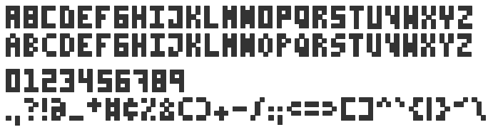
Because the idea of using a single pixel height logo really didn't take off?
WynterDragon wrote:
Because the idea of using a single pixel height logo really didn't take off?
That might be the case. Don't forget this site though. :)
-
I'm just guessing, but I believe it's related to the way browsers where first introduced - connect to the World. The globe. You gain access the "a world of information" etc. I guess that rhetoric stuck. So, working as a designer for Vivaldi (the browser) and being involved in designing our own icon, we felt it was natural for us to counter this. We're the square peg (in a round hole) of browsers, literally.
Atle Mo wrote:
we felt it was natural for us to counter this. We're the square peg (in a round hole) of browsers, literally.
Yes, you're actually very cool. Having gone upstream (or up-fjord?) for twenty years (couting Opera as well) is worth respect.