
Logo
-
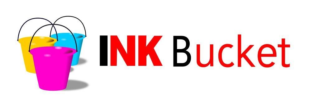
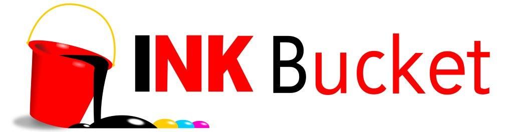
There is a man I know, albeit not very well, who is more of a good friend of a friend of mine. Last night he came into the pub and informed me that he had taken the liberty of doing me a favour with regards to my company logo. The original can be seen Here[^] He has done Logo 1[^] and Logo 2[^] Which do you all prefer?
--------------------------------- Obscurum per obscurius. Ad astra per alas porci. Quidquid latine dictum sit, altum videtur.
-
There is a man I know, albeit not very well, who is more of a good friend of a friend of mine. Last night he came into the pub and informed me that he had taken the liberty of doing me a favour with regards to my company logo. The original can be seen Here[^] He has done Logo 1[^] and Logo 2[^] Which do you all prefer?
--------------------------------- Obscurum per obscurius. Ad astra per alas porci. Quidquid latine dictum sit, altum videtur.
BTW, you are aware that the fonts are different sizes and that they don't line up, aren't you?
I wanna be a eunuchs developer! Pass me a bread knife!